The UK Amazon UX team asked The UX Agency to support their internal business teams to deliver a very high-profile project — Amazon's first insurance product. I was the principal designer with full responsibility for the customer experience and UI design, also supporting the user research stages.
Amazon's strategy wasn't clear enough for customers
Amazon's initial approach was to deliver a USP through researching, comparing, and buying insurance. The UX Agency team challenged this heavily — it wasn't a clear enough proposition for customers navigating a complex market with dozens of variables across policies.
The design challenges were significant:
- Creating a journey through the many questions needed for an insurance quote without it feeling arduous
- Building a fully responsive comparison layout with a large amount of information that still led to a conversion
- Making policies genuinely comparable when insurers deliberately make this difficult
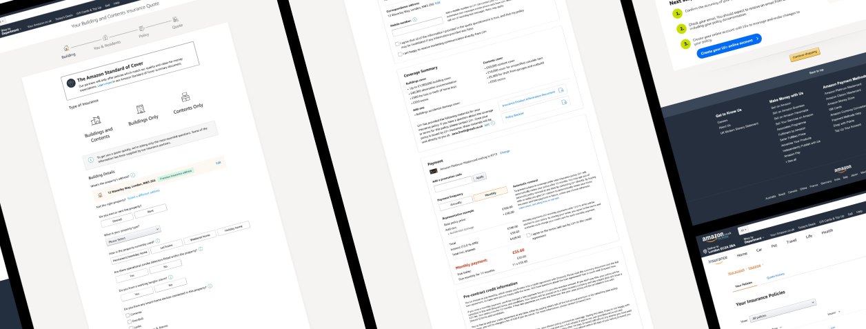
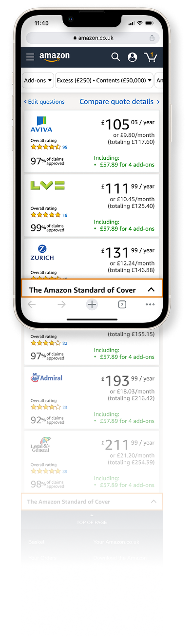
The Amazon Standard of Cover
I proposed — and Amazon accepted — that we package the product around a concept I called the Amazon Standard of Cover. Rather than comparing like-for-like across incompatible policies, we defined a minimum standard that all policies in the comparison must meet or exceed. Customers could then be confident that any policy shown was already a quality baseline.
I am proud of this solution. It is unique in a very competitive market and delivers to millions of Amazon customers. It tested very positively in the second round of user testing.
The journeys were highly complex with many conditional states based on customer-provided information. I started with mobile — the more constrained surface — before expanding to desktop.
The experienced research team at The UX Agency led customer research once I had a full journey prototyped. Insights from two rounds of testing refined the proposition and provided the evidence Amazon needed to move forward.
Working with Amazon also meant collaborating with their US-based Bar Raising team — they challenged our approach rigorously to ensure the best possible outcome for their customers.
Reflections
Working with Amazon was a privilege and an insight into how their processes work. The rigour is real — Bar Raising sessions genuinely challenged assumptions and made the product better. As a designer, it's a particular satisfaction to see the exact design specs and experience I handed over appear in production for millions of customers.
The most valuable skill I exercised was critical thinking at the strategy level — not just executing a brief, but interrogating whether the brief would serve the customer. That instinct is what led to the Amazon Standard of Cover proposition.