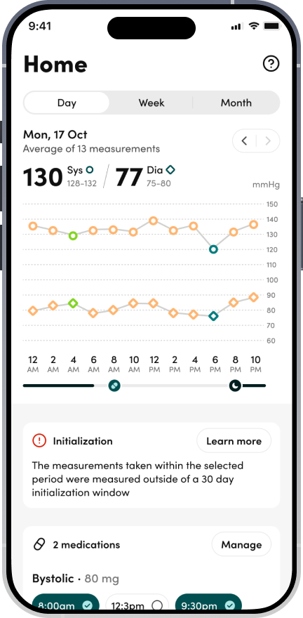
Aktiia (later rebranded as Hilo) makes a wearable that continuously monitors blood pressure throughout the day. When I joined, the app worked, but it didn't really help! Users landed directly into a chart view of their readings, split by day, week, and month. It was accurate, clinical, and largely meaningless to most people.
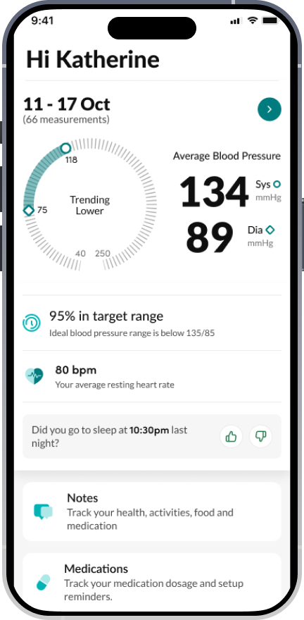
The first task I was given was to design an overview screen. What followed was two years of rethinking how people relate to their own health data: not as a number to react to, but as a trend to understand.
Several hard problems, all at once
Blood pressure is not a single number
Most users came in with a cuff-at-the-doctor mental model: one reading, good or bad, done. But BP fluctuates naturally throughout the day — stress, exercise, posture, and time of day all move it. Showing raw measurements without context was causing anxiety and distrust.
A genuinely new way to measure
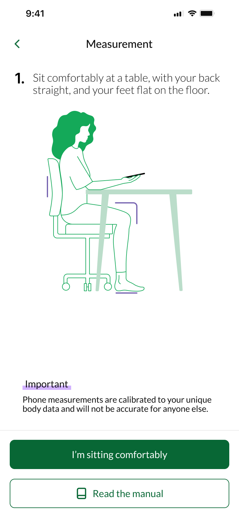
We integrated Hilo Lens: a cuffless blood pressure measurement taken by placing a finger directly on a phone camera lens. No established design pattern existed. Camera placement varies across every Android handset. We also had to handle keeping the finger still, ensuring hands were warm enough for a reliable signal, and recovering gracefully from errors.
Three data sources, one coherent picture
Users had readings from three sources: the Aktiia wrist band, a traditional cuff, and the new Hilo Lens. These measurements could differ significantly — for physiologically valid reasons — but users interpreted differences as the product being unreliable.
A half-finished rebrand, on a deadline
A London agency was brought in to rebrand Aktiia as Hilo. The output was incomplete: we had a name and some visual direction, but no differentiation between free and premium tiers. I applied the brand to the app under time pressure and invented the premium differentiator — the Hilo Wave — from scratch.
A community of 700, and data from the engineering team
I used a community of 700 beta users to validate key design decisions, typically receiving around 200 responses per survey. Research focused on concept comprehension — specifically, whether users understood what "time in target range" meant, whether they found natural BP fluctuation reassuring or alarming once explained, and how they interpreted discrepancies between measurement types.
For Hilo Lens, research was observational and metric-driven. Drop-off data from the engineering team identified the specific points in the flow where users abandoned the measurement. This data drove the most important decision of the whole project.
Usability findings fed into the FDA application — documented evidence that the product could be used safely and effectively by real users.
Designing for the most constrained case first
For Hilo Lens, I initially designed generic flows that worked across all Android handsets. Drop-off data showed consistent failure points — users couldn't reliably identify which lens to use or how to hold the phone. We made the decision to narrow scope: design specifically for iPhone first, using actual iPhone photography to show users precisely where to place their finger.
This felt like a step backwards. It wasn't.
Error recovery was designed iteratively: hand-warmth prompts, stillness cues with clear visual feedback, and step-by-step recovery screens that diagnosed the specific error rather than showing a generic failure state.
What shipped
Hilo Lens shipped and iterated
A completely novel measurement interaction designed, launched, and refined — with a 70% reduction in drop-offs after narrowing to iPhone-specific design.
Full app rebrand across iOS and Android
Including the Hilo Wave premium differentiator, brand-consistent design system, and component library bridging Figma to engineering via Figma Make.
FDA application contribution
Usability evidence and design rationale submitted as part of the regulatory application — documenting that real users could use the product safely and effectively.
Promoted to Head of Design
Took on brand governance across product and marketing in July 2025, line-managing the brand designer and bringing in a creative director to align with the new CEO.
What I'd do differently
Education is retention. Users who didn't understand how calibration worked dropped off at a higher rate. The last project I completed was redesigning onboarding to require four calibrations over four days — making the setup feel like a meaningful start, not a gate. I should have advocated harder for it, earlier.
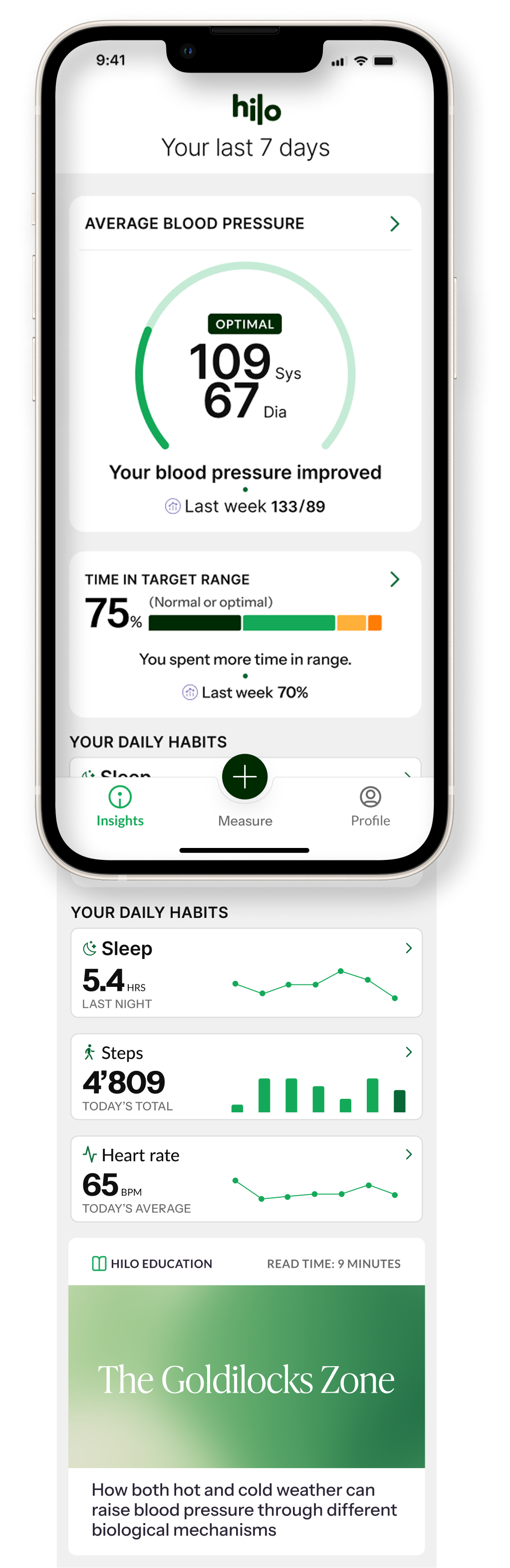
More data is not more value. Steps, sleep, activity — all added without a story for how they connected to blood pressure. We created data silos instead of insight. The design work I'm most proud of pushed in the opposite direction: taking complex physiological data and distilling it into one metric that changed how users felt about their own health.
Constraint produces clarity. The Hilo Lens decision to drop Android support temporarily felt like failure. It led to our best outcome. Designing for the most constrained, most common case first — then expanding — consistently outperformed designing for the general case first.