Kate Shaw
← All work
Executive education · Web · 2018 – 2020

What two rounds of research changed about a business school's front door

A homepage that hid its navigation behind a Menu button and its section titles in small grey caps. Three research methods, four iterations of the navigation, and the changes that shipped because they needed no one's permission.

My role Head of Design & Customer Experience
Team 2 designers · 1 PO · external research agency
Research 198 remote · 95 tree test · 11 in person
Outcome +30% onward journeys

IMD is one of the world's top business schools. When I joined as Head of Design and Customer Experience, the problems with its homepage were well understood inside the building: confusing navigation, a cluttered layout, no wayfinding. A redesign had been attempted before and had failed to ship. The organisation had concluded that user testing was subjective opinion, which meant the first job was not design at all: it was getting a sceptical management team to fund evidence.

What the evidence then did was more interesting than a clean win. It told us, twice, that the new design wasn't working yet. This page is about what we did with that.

What was wrong, specifically

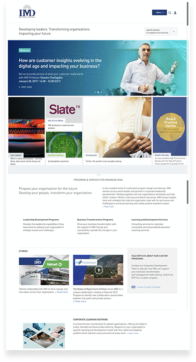
The IMD homepage in 2019: a Menu button and search icon top right, a Quick Access dropdown, a rotating promotional hero, and a section titled IMD Research and Knowledge above a row of promo tiles
  1. All navigation hidden behind a single "Menu" button. Users didn't know where they were on the site because the site never told them.
  2. A second, competing entry point. The "Quick Access" dropdown was used more than the menu (12% vs 10% of first clicks in the remote test), which is a sign the menu had already lost.
  3. A rotating promo hero doing no wayfinding: whatever was being marketed that week.
  4. Section titles in tracked caps, and on the January version of the page, tiny grey ones. "Titles are missing or too small" was a verbatim research finding.
  5. Every call to action an inline » link. Nothing on the page looked like the next step.
  6. Promo tiles on no consistent grid, each with its own coloured label, competing with each other rather than with the navigation problem.
The homepage I inherited, captured in spring 2019. The tagline was fine. Everything a visitor needed to move was hidden or small.

Two rounds that said "not yet"

With a local research agency I ran three methods. Eleven moderated sessions in November 2018 with MBA and open-programme prospects gave the diagnosis: orientation, navigation items that were hard to notice or interpret, a programme portfolio nobody understood, and the recommendation to "add key elements such as section subtitles to help the visitor navigate, and make them recognisable, for example with a large text font".

Then the two rounds that mattered. A remote A/B prototype test on Loop11, 198 participants, four tasks, current site against the new design: no significant improvement in task success, one task worse (finding IMD's ranking: 63% on the old site, 49% on the new), and three conclusive brand-perception scores against the new design, on Professional, Premium and Attractive. And a TreeJack tree test of the proposed navigation, 95 site visitors, ten tasks, six minutes each: success fell against the 2015 baseline on seven of nine comparable tasks, only 34% could find Events, and the report's verdict was that "this new navigation cannot be implemented as such".

The findings that changed the design, verbatim: "participants are generally lost with the program's categories"; "a lot of participants click on the 'For organisation' link, even when the 'for individual' link is opened" (15% cross-contamination in both directions); "the section 'Research & knowledge' sounds too generic"; and, on the old site, "quick access is more used than the main menu".

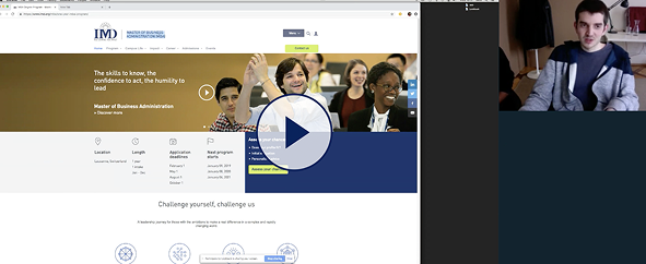
A still from a recorded moderated session: the participant's browser on an IMD programme page, with a webcam view of the participant beside it
A moderated session recording. Getting a research-sceptical organisation to fund three rounds of this took as much effort as the design.

Four versions of the navigation

The navigation went through four documented versions between March and June 2019, each a response to what the last round of research had said.

Level-one and level-two labels across the four versions, from the working file. v3 is the version the tree test rejected; v4 is the response.
Version Labels What changed and why
v1 · March Programs · Faculty & Research · Alumni · About IMD
Level 2: For Individuals · For Organisations
Navigation out from behind the Menu button, four items, Program Finder promoted to the utility bar. Dropdown as a small panel sized to its content.
v2 · March Same labels as v1 The dropdown becomes a full-bleed megamenu band. Same words, a different container: the whole width says "this is the map".
v3 · May Programs · Research & Knowledge · Faculty · Alumni · About IMD
Level 2: Programs for Individuals & Teams · Programs for Organisations
"Faculty & Research" split in two so research could stand alone. Level 2 spelled out in full. This is what the tree test rejected: the two long "Programs for" labels cross-contaminated, and "Research & Knowledge" pulled traffic it shouldn't.
v4 · June Programs · Research & Knowledge · Faculty · Alumni · About IMD
Level 2: For Individuals & Teams · For Organisations
Level 2 shortened so the two entries stop competing head to head under "Programs". Five items kept. A small component set for the menu: three level-one states, a listed and an unlisted level-two style.
v1 · panel Wireframe of the v1 navigation with Programs open: a narrow dropdown panel listing For Individuals and For Organisations, with the programme categories beside it
v2 · megamenu Wireframe of the v2 navigation with Programs open: the same labels in a full-width megamenu band
v1 to v2 is a container decision, not a label one: the same six programme categories, first in a panel, then in a full-width band that reads as a map of the site.

What shipped without sign-off

With a large number of stakeholders and a management team impatient for results, I split the work in two. The navigation needed everyone's agreement and another round of testing. Section titles and calls to action needed nobody's, so those moved first. The comp below is the homepage as designed in spring 2019; it carries the four-item v1 navigation because it predates the v3 and v4 work above, and one card still has placeholder text.

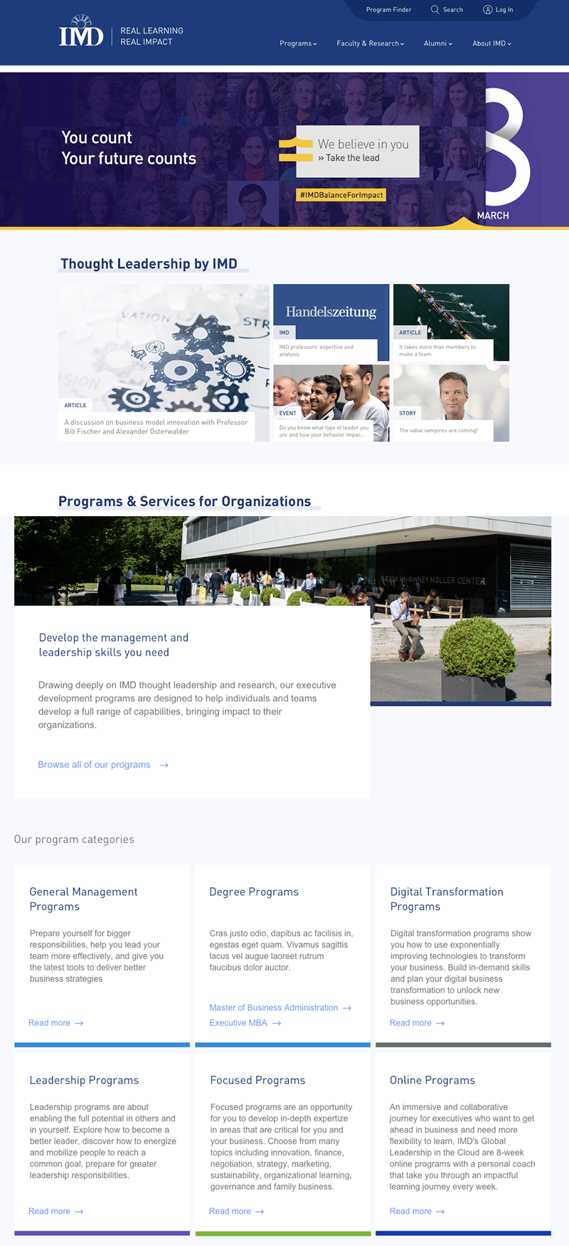
The redesigned IMD homepage comp: a navy header with a visible four-item navigation and a utility row, a hero, large section headings with a highlight block, a consistent card grid with category chips, and six program category cards with descriptions
  1. Program Finder promoted to a utility row with Search and Log in: the thing people came for is always one click away.
  2. Navigation visible, four items, persistent. No Menu button, no Quick Access.
  3. Section titles as large sentence-case headings on a highlight block, the direct answer to "titles are missing or too small".
  4. One card pattern with a consistent chip for the content type (ARTICLE, EVENT, STORY) instead of tiles that each invented their own label.
  5. One content card overlapping the photograph, with an arrow link that looks like the next step.
  6. Every programme category described in plain English, mirroring the six categories in the navigation so the page teaches the menu.
  7. "Focused" lists its topics: innovation, finance, negotiation, strategy. The tree test had asked us to help visitors "understand what is being Focused".
The redesigned homepage. The first three decisions are the ones that shipped without stakeholder sign-off.
Before Old section title: IMD RESEARCH AND KNOWLEDGE in tracked capitals, with an inline All Research and Knowledge text link at the right
After New section title: Thought Leadership by IMD in bold sentence case sitting on a grey highlight block
The section-title decision, one above the other. Sentence case, weight, and a highlight block that makes the title scannable from across the page.
The redesigned Research and Knowledge hub: a colour-blocked topic navigation across the top, a featured video with a large title, a row of latest awards and honors, and trending publications
The Research & Knowledge hub, designed alongside the homepage: a colour-blocked topic bar, one featured piece with a large title, and publications as a list people can scan.

What changed

1

Titles and calls to action shipped first

Redesigned section titles for scannability and homepage CTAs for wayfinding, the low-hanging fruit that needed no sign-off, so the project showed results while the navigation was still being argued over.

2

Navigation rewritten twice, on evidence

v3 tested, failed, and became v4. The labels that shipped were the ones the tree test hadn't broken.

3

Stakeholders inside the process

Workshops that put customers first and led to the least glamorous, most useful outcome of the project: cutting down the amount of content on the page.

+30%
increase in onward journeys from the homepage
Measured in Google Analytics after launch, for a project that had previously failed to deliver anything at all
Moderated usability sessions Remote A/B prototype test Tree testing Navigation IA Wireframes Visual comps Stakeholder workshops Management-team presentations

What I learnt

Research that says no is still research. The Loop11 and TreeJack results were the useful ones. A test that flatters the new design tells you nothing you can act on; a test that finds two "Programs for" labels cannibalising each other tells you exactly what to change.

Ship what needs no permission. Section titles and calls to action moved before the navigation could, and they moved the number. In an organisation with many stakeholders, sequencing the work by who has to agree to it is a design decision too.