I joined Yoti when it was just 15 people. I was brought in to transfer the UX and design work that had been done by an agency, in-house, alongside the Head of Design. Yoti's mission was to become the world's most trusted digital identity platform.
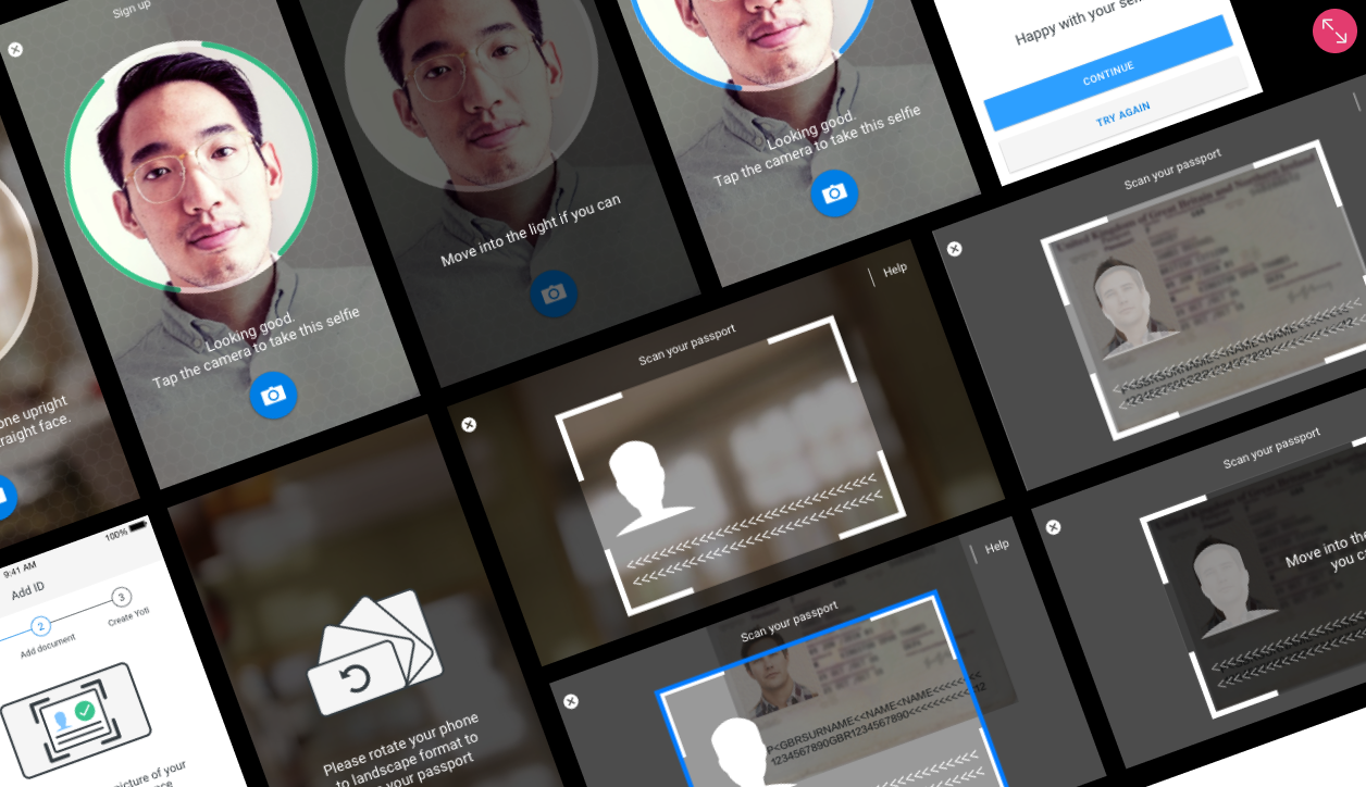
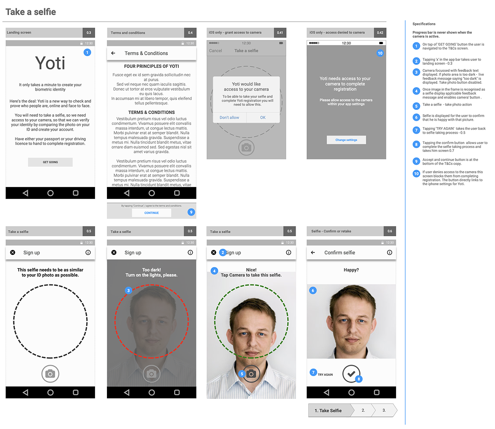
User testing had never felt so crucial: the app offered brand new technology that involved sharing personal identity documents. Users were sceptical and also physically challenged by the requirement to scan documents using their smartphones.
Asking strangers for their passport
- A strong and rigid tech voice that didn't speak the user's language
- A physical challenge — scanning a passport with a smartphone was not intuitive in 2015
- Security and brand concerns from users: "I'm really worried about scanning my passport. Where does the information go?"
The app was very much product-led at the time — development drove decisions. I wanted to foster a culture of collaboration with the tech team and incorporate user testing to change that dynamic.
- Are the business goals aligned to customer needs?
- How can we clearly explain the concept of the product?
- Ensure design thinking is applied to our processes
- How do we lower the barrier to entry whilst maintaining security?
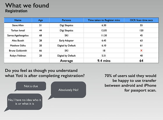
KPIs: Time on task · Success rate · Trust score · Security standards maintained
Guerrilla testing with what we had
As a small start-up we didn't have the budget for a testing lab. I recruited participants and set up a simple mobile testing device with an overhead camera in our only meeting room. We committed to a two-week test, iterate, and test-again cycle.
Key insights from testing:
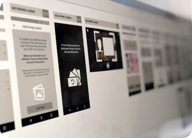
- No understanding of needing to turn the phone to landscape
- Didn't understand the two boxes on the scan screen, or what information needed to be within each
- No notice taken of help text about glare and light on the passport affecting scan quality
- Manually entering passport details — the date picker defaulted to today
- Placing phone on back page of passport caused confusion
- Automatic scanning wasn't understood — users expected to take a photo
Two changes that moved the metric
Focus on usability
The iterative testing gave us clear goals for usability improvements. I was able to demonstrate to leadership and the development team exactly where compromises were needed to maintain security integrity while improving usability.
Changing the flow
The long registration flow was too big a barrier to entry. Working with the Head of Design, I convinced the team to allow users to browse and play with the app before adding an ID document — a drastically simplified registration that let the product speak for itself first.
Reflections
This project established my belief in the power of guerrilla research — you don't need a lab and a budget to discover what matters. A phone, an overhead camera, a meeting room, and real users will tell you everything a perfect research setup would tell you.
The trust challenge at Yoti was also formative. Designing for a product that handles sensitive personal data taught me that trust is designed in at every touchpoint: the language, the visual hierarchy, the order of steps, the error messages. Every detail either builds trust or erodes it. There's no neutral.
I also learnt the value of establishing a research culture from scratch. Integrating user research into existing scrum routines — making it a standard part of each sprint rather than a project-level activity — was one of the most impactful structural changes I've made in any role.